Stationery Suite · 2026
Event Identity Document · Direction B
CS
Brand & Business · Leith, Edinburgh
The Cold StoreThe Painted Mark
Seven pieces · Two grounds · One mark
Seven pieces · Two grounds · One mark
The brief
Ingrid Halvorsen cooks everything over live fire, in a 1911 dockside ice house built to keep things frozen. She bought the building in 2021 and spent three years restoring it — keeping every original cork slab she could save, and cutting the ones too far gone into the bar front.
Her instruction on tone was unusually clear, and most of it was a list of refusals: no drawn flame, no ember-glow gradient, no fish or lobster line-drawing, no chalkboard lettering, no kraft-paper rustic, no letterspaced serif used to signal expense. And no snowflake — “the building was a cold store, it was not a fairy tale.”
What she wanted instead: industrial preservation, not industrial pastiche. A Donald Judd room. The way a good conservation architect leaves the repair visible.
The mark
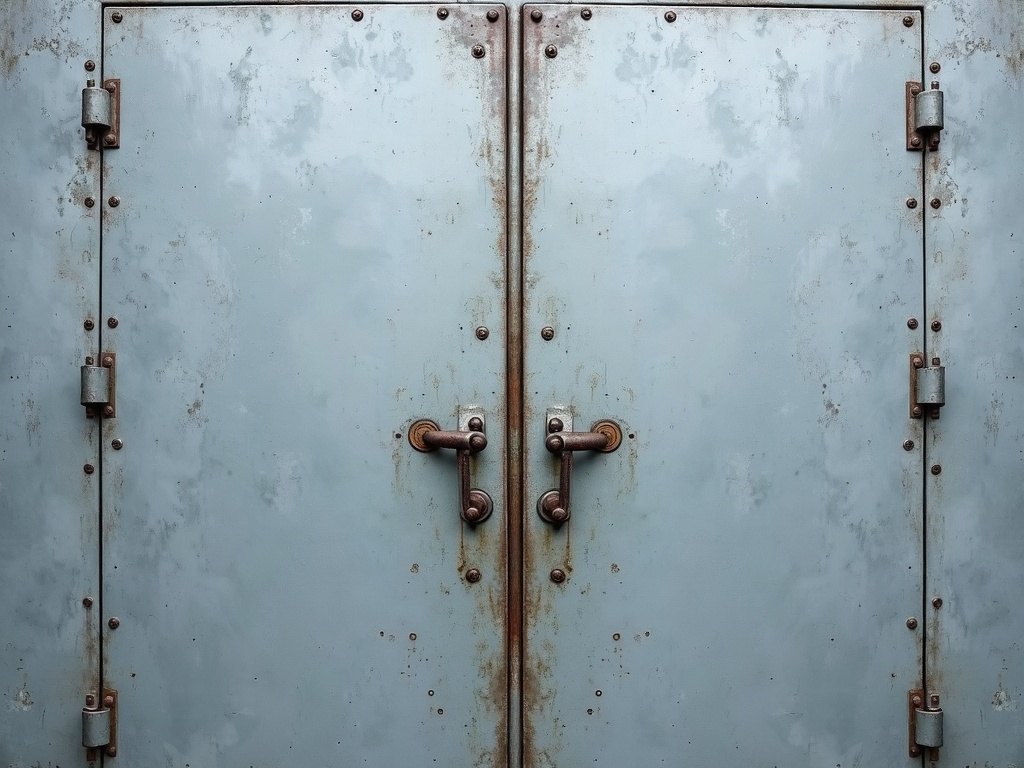
The restaurant’s name is stencilled in white on the building’s cast-iron door, and Ingrid deliberately did not repaint it. So the suite does not describe the door — it carries the door’s own marking, at the size and in the condition it was found, drips included.
One rule governs every surface: the approved mark appears exactly once. It may be cropped by the trim, but it is never duplicated, never mirrored and never redrawn — a cleaned-up vector version of it was explicitly refused. Every piece carries the same pixels.
The system
The mark is white. On a zinc board it sits at 1.04:1 against its own ground — which is to say the identity is invisible, which is what the first version of this suite did on all seven pieces and then propped up with drop-shadow filters drawn around a mark that was not there.
So the ground is decided by what a piece has to do. The pieces that stand for the building — the invitation, the welcome sign, the table cards read across a dim room — run on ice, and the white paint is itself. The pieces you pick up and read at arm’s length stay on the zinc board, and there the same mark is taken as a blind impression half a step under the stock.
White is reserved for the paint alone. Even on ice, the name is set in zinc, not white — so the one white thing on any surface is still the mark.
Invitation, welcome signage, table cards. The white stencil at full strength, as it is on the door.
Menu, bar list, place cards. The same mark, blind — an impression in the board rather than an ink hit.
The palette
The suite
The master object, and the only piece where the mark is cropped by the trim on three sides at once — it is allowed to run off, and the crop is what makes it read as found rather than placed.
The drips are left where they fell. They are the only evidence on the card that the mark was sprayed and not set, and the type block opens below them on clean ice rather than fighting them for the same space. One ember rule, and a reply code that actually scans.
A working piece, so it keeps the zinc board. Three courses, named for what actually happens to them — to begin, over the fire, to finish — and the dish and nothing else, which was the client’s instruction on voice.
Each course opens on a short rule, and on the fire course that rule is the ember. It is the only warm ink on the card, and it is how the heat gets onto a menu that was refused a drawn flame, an ember gradient and a glow. The mark closes the foot, blind.
A narrow card with the mark at the head, blind. The fino on tap and the Leith beer brewed for the room are given exactly equal weight.
The third band says there is no cocktail list tonight — set in the same type as the drinks above it, because on an opening night the absence is the point and not an apology. One ember rule closes the foot.
Shown out of scale — every other specimen on this page is at 3.4px per mm; the sign at that scale would be 2.4 metres wide.
No board and no frame — the same white, stencilled straight onto the brick, in the technique the door was marked with.
This is the one piece where the mark is at full scale and is not cropped by a trim. At eight metres a sign is read as a shape before it is read as words, so the shape is given its whole self, and the name sets beside it as a lockup rather than under it as a caption.
The mark at a quarter size beside the name — which is what this piece has always been described as doing, and what it did not do: it sat in the top corner with twenty millimetres of empty board between it and the name, on a card only sixty-four millimetres tall. A horizontal lockup closes that gap and reads as one object.
The name holds a 14pt floor so it stays readable in a dim room. The address block and the ember are both dropped — at this scale they would only be noise.
The only pieces that drop the mark completely: at this size, the system says, only the type survives. They run on ice rather than zinc because a table card is the one thing in the suite read across a room instead of in the hand — that is the signage job, so it sits in the signage register, and the place card lying flat beside it stays zinc.
Tables are named for the fishing boats that supplied the ice house — Sereno, Fidelity, Mairi Bhan, Ocean Gain, Provider, Radiant Star. The seventh is Solveig, Ingrid’s grandmother, who packed herring in this building at fifteen and is ninety-one and coming to the opening. She asked for her name on something without it being sentimental. It is set identically to the boats and no larger.
How each piece was derived
Each piece is given a ground and a decoration level, and it drops exactly what that level says to drop. Nothing on the list below is a judgement made twice.
| Piece | Ground | Decoration | What it keeps, and what it drops |
|---|---|---|---|
| Invitation | Ice | 1.00 | The mark cropped by three trims, the name in zinc, one ember rule, the reply code. |
| Welcome signage | Ice | 0.80 | The mark at full scale and uncropped — decoration climbs with reading distance. Drops the board. |
| Menu card | Zinc | 0.55 | A blind mark at the foot; the ember spent on the fire course and nowhere else. Drops the bleed. |
| Bar & drink menu | Zinc | 0.55 | A blind mark at the head; one ember rule at the foot. |
| Place card | Zinc | 0.25 | A quarter-size blind mark beside the name, and the 14pt floor. Drops the address block and the ember. |
| Table card | Ice | 0.20 | Drops the mark entirely. Only the type survives. |
Production
Palette
Zinc #D9DEE0 · Ice #2F3A40 · Ember #C4622B · Paper #EFF1F1. The ember covers about one per cent of the suite and never carries a word.
Typeface
Hanken Grotesk leads every piece; Fraunces appears only as tracked-caps support lines. Lining numerals throughout — the industrial register.
Technique
Opaque white screen print, double hit, on ice board. The same mark blind-debossed on the zinc pieces. No foil, no die-cut, no liner — flat working pieces, the hospitality register. Print files as PDF/X‑4.