Two ways to put fire in a cold store. The building was made in 1911 to keep things frozen; Ingrid is going to cook everything in it over live fire. Both worlds take that contradiction literally — one from the building’s substance, one from its signage. Neither softens it.
World AThe Salvage Slab
World BThe Painted Mark
ChosenB
Where it started
Two ways to put fire in a cold store. The building was made in 1911 to keep things frozen; Ingrid is going to cook everything in it over live fire. Both worlds take that contradiction literally — one from the building’s substance, one from its signage. Neither softens it.
She is not opening a restaurant in an old building. She is putting her grandmother’s workplace back into use.
World A
The Salvage Slab
A
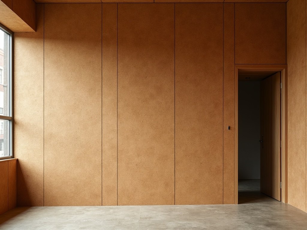
Cork insulation, ochre and granular, with everything pressed into it and no ink at all — because Ingrid kept every slab she could save and cut the rest into the bar front. The identity is not drawn onto the cork; it is a shape cut out of it. The guest feels it before reading it: a thumb over the impression at the door.
The Salvage Slab
Cork Slab
#EFE6DC
The surface this world is set on.
Cork
#B4653A
Sampled from the pictures — it lives in the photographs, not the layout.
Bracken
#3A2C22
What every word in this world is set in.
Ember
#C4622B
The colour allowed to lead — rules, marks, accents.
Fraunces · display, cut for paper not screens
Hanken Grotesk · tracked-caps support
✕ Drawn flame, ember-glow gradient, any fire imagery
✕ Fish or lobster line-drawings
✕ Snowflake or ice-cube motif
✕ Chalkboard lettering and “artisan” script
✕ Kraft-paper rustic and Edison-bulb warmth
✕ A letterspaced serif used to signal expense
World B
The Painted Mark
B
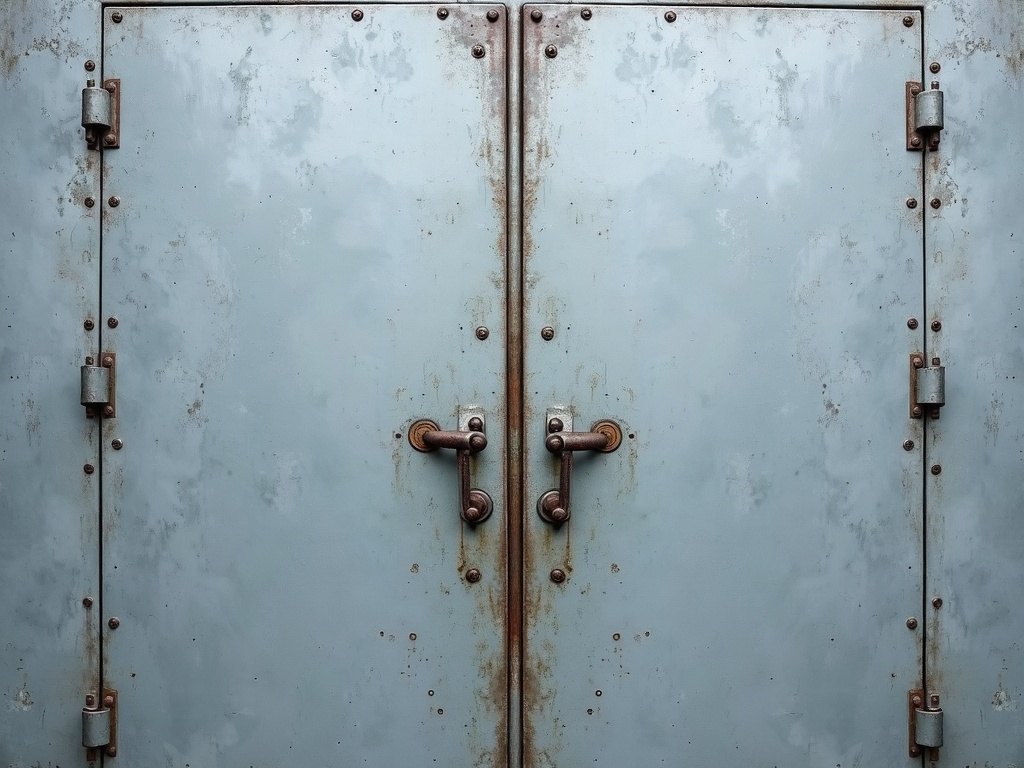
Cold zinc grey carrying a white mark sprayed through a stencil plate and bled at the edges — because the name on the cast-iron door has never been repainted, and Ingrid was right not to. The mark is reproduced, never redrawn. Ranged hard, like a shipping mark, because that is what it is.
The Painted Mark
Ice Shadow
#2F3A40
The surface this world is set on.
Zinc
#D9DEE0
Two jobs: the board the working pieces are printed on, and the ink every word takes on ice.
Stencil White
#FFFFFF
The mark, and nothing else. Not even the name — so the one white thing on any surface is the paint.
Ember
#C4622B
One rule per piece, and never a word — at text sizes it reads 3.0:1 and would fail.
The working stockZinc board · menu card, bar list, place cards
Quoted from this suite's own production spec — the two stocks the pieces were actually printed on. This world was always set on ice: the mark is white paint, and white paint on a zinc board is a 1.04:1 contrast, so the pieces that stand for the building take the dark stock and the pieces you pick up keep the zinc. Surfaces are rendered from that spec, not photographed.
✕ A cleaned-up, vectorised version of the stencil mark
✕ Drawn flame, ember-glow gradient, any fire imagery
✕ Fish or lobster line-drawings
✕ Snowflake or ice-cube motif
✕ Chalkboard lettering and “artisan” script
✕ A letterspaced serif used to signal expense
The decision, as they saw it
The substance, or the signage.
A · The Salvage SlabB · The Painted Mark
World B · Chosen
The Painted Mark
The Painted Mark was approved. Seven pieces reproduce the door exactly, and then get out of the way.