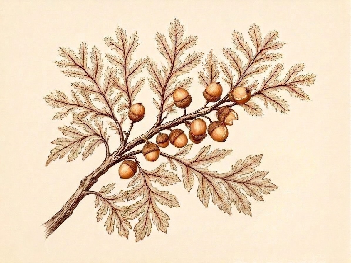
La Maison de Fêtes
Creative Direction Proposal

Lily & James

The Wedding · October 24, 2026
Contigo RanchFredericksburg, Texas 165 GuestsWestern Formal Six Design Pieces
For Client Review
02 — Colour

The Palette: Terracotta & Linen

Terracotta #C4956A Primary brand · hero warmth
Linen #E8DFD0 Paper ground · background
Dark Pecan #3D2B1F Primary text · deep anchor
Warm Tan #8B7355 Secondary text · mid-tone
Turquoise #4E8D8D Single accent · the bolo
Limestone #D4C9B5 Texture wash · border
October Sky #B8C4C4 Direction B sky · rare use

This palette is the land in October — the warm red-brown of limestone soil, the bleached cream of sun-dried grass, the dark bark of live oak. The turquoise is a single thread running through the entire suite, never dominant, always meaningful: it honours the New Mexico stone in James's grandfather's bolo tie.

03 — Typography

The Type System

Display — Playfair Display
Lily & James
LJW

Contigo Ranch · Fredericksburg · Texas

Together with their families, Lily Anne Whitfield and James Robert Whitfield invite you to celebrate their marriage.

LJW
Whitfield Monogram
Lily & James
October XXIV · MMXXVI
Body — EB Garamond · Small Caps — Playfair Display SC

Saturday, the twenty-fourth of October, two thousand and twenty-six, at five o'clock in the afternoon. Contigo Ranch, Fredericksburg, Texas. Western formal attire. Boots encouraged.


This type system references the editorial serif tradition of fine Texas almanac printing — authoritative, warm, and specific. Playfair Display at weight 900 anchors the monogram and headline names. EB Garamond carries the body copy at reading size. Small caps throughout for labels and datelines.

Direction A — The Field Study
Quercus fusiformis Sp. No. 24 · Oct. MMXXVI · Fredericksburg, Texas Hill Country Live Oak
Direction A · Concept Preview · Not Final

The Field Study

A naturalist's record of a specific place. Fine-line botanical illustration in the tradition of 19th-century field guides — documentary precision, warm terracotta ink, aged linen ground. This direction treats the invitation suite as a naturalist's specimen plate. The live oak branch is drawn with the same documentary care a field scientist would bring to Quercus fusiformis — not decorative, not impressionistic, but precisely this tree on this ranch.

Typography reads like a fine Texas almanac: Playfair Display in editorial serif, small caps for datelines and labels, EB Garamond carrying the invitation copy at reading size. The overall impression is of something handmade by someone who knows this county — not imported luxury, but the kind of beauty that grows from a specific place. The turquoise stone appears as a specimen-tag element: a small scientific label in the botanical illustration tradition, carrying the New Mexico blue-green as its only colour.

Direction A · The Field Study · Concept only — typography, layout, and proportions will be refined to final quality
Direction B — The Ranch Sky
CONTIGO RANCH · FREDERICKSBURG · TEXAS
Direction B · Concept Preview · Not Final

The Ranch Sky

Georgia O'Keeffe's formal grammar transplanted to Texas Hill Country. Bold, simplified forms. The land as protagonist — horizontal, vast, impossibly warm at golden hour. This direction takes O'Keeffe's central insight — that you can reduce a landscape to its essential form and gain power, not lose it — and applies it to Contigo Ranch. The invitation is landscape-oriented: wide, horizontal, sky-dominant. The live oak appears as a bold graphic silhouette rather than a botanical specimen.

The palette stays warm but pushes into the dramatic register: deep terracotta golden hour, October sky in muted blue-grey, the dark silhouette of the tree against a luminous horizon. Typography is bolder and more monumental — Playfair Display 900 weight, generous tracking, set against the landscape as if branded onto the land itself. The turquoise appears as a single geometric accent — a small carved-stone quality element placed beside the monogram, the way turquoise appears set in silver.

Direction B · The Ranch Sky · Concept only — texture, layout, and proportions will be refined to final quality
The Emotional Core
"This is the land that makes sense to us." — A ring lost in the grass for twenty minutes. A story told at every dinner since. The live oak grove where he proposed is the same grove where you'll be married.
Lily & James Whitfield · Contigo Ranch · October 24, 2026
07 — Declaration

How We're Approaching This

The Creative Approach

Naturalist Editorial — Land-Specific

This suite will not look like a Texas wedding. It will look like this wedding — the one that happens on a working ranch in Gillespie County in October, under a live oak grove where a ring was once lost in the grass.

The design language draws from the naturalist field guide tradition (documentary precision, botanical specificity), Georgia O'Keeffe's formal boldness (simplified forms, land-as-protagonist), and the warm editorial photography of Jose Villa (film light, airy spacing, no harsh blacks).

The result is something that feels simultaneously historic and contemporary — as if this specific ranch had a resident designer who understood both the landscape and fine typography.

A single turquoise accent runs through the entire suite — honouring the New Mexico stone in James's grandfather's bolo tie. It appears once per piece, never dominant.
What We Will & Won't Do

The Brief's Commitments

The suite will include:

  • Live oak branch as the central botanical motif
  • Turquoise accent (one per piece — the bolo tie)
  • Playfair Display + EB Garamond type system
  • Terracotta / linen / dark pecan palette throughout
  • A very small blue heeler on the favor tags — Brisket (don't tell James)
  • Western formal dress code language, warm and specific
  • The LJW monogram at 900 weight

The suite will never include:

  • Hay bales, mason jars, or barn wood textures
  • Generic rustic / Pinterest 2014 aesthetic
  • Cowboy hat clip art
  • Shiplap or farmhouse visual language
  • Watercolour washes or overly soft edges
  • Cool-toned or vivid blue/green colour temperature
Design Suite — Six Pieces
01 Digital Invitation The centrepiece. Hero botanical illustration, full copy, QR RSVP link.
02 Menu Cards Four-course Hill Country menu. Dietary callouts. Editorial serif typography.
03 Table Numbers 01–20. Small botanical accent per number. Consistent with suite.
04 Welcome Signage Large-format. Venue directions, timeline, dress code. Monogram centred.
05 Custom Monogram LJW at full weight. Both directions produce unique monogram variants.
06 Favor Tags Brisket the blue heeler — small, tucked, for the guests to find. James will cry.
08 — Atmosphere

The Sound of the Day

Music is reference material for the emotional register of a suite — it tells us how fast the tempo should feel, how much space to leave, whether the design breathes or drives. These selections informed the design.

Ceremony
"Helplessly Hoping"
Crosby, Stills & Nash · Acoustic Guitar

Longing resolved. Folk harmony, open chord voicings, something that could have been written on a porch in this county. The design should breathe like this song.

First Dance
"Making Plans"
Miranda Lambert

Rootedness. Choosing a place. The specific Texas warmth of this record — the pedal steel, the unhurried tempo, the sense of arriving somewhere and staying.

Dinner & Dancing
Reckless Kelly — Live
Country / Americana band

The room comes alive. Two-stepping under string lights. Garrison Brothers poured at the bar. The evening shifts from ceremony to celebration — the design can hold both registers.

At 23:30
Breakfast tacos served.
Under the same stars as the ceremony.

A wedding that ends the way it began — casual, warm, entirely itself. The favor tags are already in their guests' pockets.

Your Turn

Which direction feels like your wedding?

Both directions are rooted in the same briefing, the same palette, the same love story. They diverge in how they tell it — one through the precision of a naturalist's eye, one through the bold clarity of a painter's.

A
The Field Study

Fine-line botanical illustration. A naturalist's record of the land. Precise, warm, documentary — like something made by someone who knows this specific grove of live oaks.

OR
B
The Ranch Sky

O'Keeffe's formal boldness. The sky above the ranch at golden hour. Graphic, atmospheric, monumental — the land as it looks at the exact moment the ceremony begins.

Reply to your designer with "Direction A" or "Direction B" — or ask any questions before you decide.
Once you choose, we build every piece to final quality. No direction choice, no design pieces. That's the deal — it protects your time and ours, and it means the final suite is coherent from the first piece to the last.
La Maison de Fêtes