La Maison de Fêtes · Creative Direction

Your Creative
Direction for
Dr. Adaeze Okafor

PhD Celebration Dinner · Trinity House, London

We have prepared two directions from your briefing. They interpret the same story differently. Read both — then choose the one that lands closest.

Event Celebration Dinner
Date 18 April 2026
Venue Trinity House, London
Guests 32
City London
Scroll to read both directions
02
The Palette
#F2EDE8
Paper
Background · breathing room
#D6CEC5
Warm Sand
Candlelight on Georgian stone
#9B7D5A
Cognac
Accents · rules · warmth
#2E2A25
Deep Charcoal
Typography · authority

Warm sand, deep charcoal, cognac — scholarly, considered, African textile warmth, intellectual, earned, proud, clear. The palette of late afternoon in a library. Both directions start here.

03
Typography

EB Garamond · one family · shared by both directions

Display Dr. Adaeze Okafor
Italic Celebration Dinner
Heading Trinity House, London
Body An intimate seated dinner for thirty-two. The dinner should feel like the best Sunday lunch of the year.
Caption Saturday · 18 April 2026 · 18:30 · Smart Formal
Direction A moodboard — literary editorial atmosphere
Direction A · For your consideration

"The Edition"
Typographic Sovereignty

The word. The weight. The silence.

The design that trusts language completely. No decoration that cannot be made from type itself. This is the London Review of Books translated into an event suite — the restraint that reads as authority, the white space that speaks as loudly as the words inside it.

The word "Dr." appears alone on the first line of the invitation, at 3.4 rem, before the name. The first time it will ever be printed. Everything else is held in its correct proportion below it. The Ankara textile — your grandmother's fabric, indigo and gold, the pattern she wore to every occasion that mattered — appears as abstracted geometry along the left margin, near-invisible, at cognac, 6% opacity. A private acknowledgement. The guests who know will find it. The guests who do not will feel something they cannot name.

Invitation preview · Direction A
La Maison de Fêtes
Dr.
Adaeze Okafor
PhD Celebration Dinner
Trinity House, London
Saturday, 18 April 2026 · 18:30
Smart Formal
Direction B moodboard — candlelit Georgian interior
Direction B · For your consideration

"The Archive"
Candlelit Presence

The room. The warmth. The arrival.

The design that holds the atmosphere of the room. Trinity House at half past six — candlelight on dark mahogany, maritime paintings in gilt frames, the precise warmth of a Georgian dining room readied for thirty-two people who crossed continents to be there. The image is felt, not depicted.

"Dr. Adaeze Okafor" in EB Garamond, large and still, anchored into warm darkness. The Ankara fabric appears as a geometric fragment in one corner of the invitation — not the full pattern, a held piece of it. An inheritance, not a display. This direction has the weight of the room behind every word.

Invitation preview · Direction B
La Maison de Fêtes
Dr.
Adaeze Okafor
PhD Celebration Dinner
Trinity House, London
Saturday, 18 April 2026 · 18:30
Smart Formal
06
What This Is
"This dinner is for the thirty-two people who kept me going. My mother flew from Lagos. My supervisor came from Edinburgh. My best friend from law school came from New York. That is the room."

When we read the briefing, we read a person who had been working for twelve years and knew exactly what this room meant. Not a graduation — a doctorate in post-conflict land restitution in West Africa, three years in the field, two writing. The dinner is not a ceremony. It is the first evening of the rest of it.

Both directions understand this. Direction A answers in silence and precision — the restraint of someone who has done the work and does not need to explain it. Direction B answers in atmosphere — the warmth of the room where the right people finally sit down together. Both arrive at the same feeling: earned.

07
Our Creative Declaration

Nothing added
that was not already
in your briefing.

Direction A · The principle

Typography does all the work. The word "Dr." earns its size by standing alone. The Ankara geometry lives in the margin — present for those who look, invisible to those who don't. The restraint IS the statement.

Direction B · The principle

The room does all the work. Trinity House at candlelight — the warmth behind the typography gives every word the weight of where it is being read. The Ankara fragment is a corner detail, held quietly.

Direction A · What distinguishes it

Pure typographic — CSS only. The most restrained version of this brief. References the London Review of Books, Toni Morrison first editions, Faber jacket design. A suite you could fold and post and it would still hold its authority.

Direction B · What distinguishes it

Atmospheric imagery as foundation. The candlelit Georgian interior grounds every piece in physical warmth. The typography meets the room rather than standing above it. References Zanele Muholi's high-contrast warmth and Teju Cole's measured prose.

What both directions share

EB Garamond throughout. The same three-colour palette. "Dr." on the first line of the invitation — the first time it will ever be printed. The Ankara textile encoded into every piece, in a different form. No mortarboard. No scrolls. No parchment. No "Congratulations." Three pieces: Digital Invitation · Menu Cards · Welcome Signage.

09
Your Choice

Which direction
speaks first?

Both directions came from your briefing — they read it differently. Choose the one that feels most like what you had in mind, and the full suite will be built from that vision alone.

Direction A
Direction A
"The Edition"
Typographic Sovereignty
Direction B
Direction B
"The Archive"
Candlelit Presence

What would you like us to look at again?

10
Every Choice Came from You

Why we made
these decisions

Each design choice has an origin in what you told us.

EB Garamond — used alone
"The publication design of the London Review of Books, the precise warmth of Teju Cole's prose, the quiet authority of a Toni Morrison first edition jacket."

All three of those references live inside one typeface, chosen with intention. One family used completely is more powerful than two used cautiously. You named it in the briefing. We confirmed it.

Warm sand, charcoal, cognac — nothing added
"Warm sand, deep charcoal, cognac, scholarly, considered, African textile warmth, intellectual, earned, proud, clear."

Your palette description was already a design brief. Three colours: sand for warmth, charcoal for authority, cognac for the earned richness. No fourth colour has been added that was not in your words.

"Dr." alone on the first line
"The title 'Dr.' should appear on the invitation — it is the first time it will be printed anywhere, and that matters."

If it is the first time, it should feel like the first time. Setting it alone, at display size, before everything else — before the name, before the event — treats it as the title it is, not a prefix.

The Ankara textile — encoded, not displayed
"My grandmother's Ankara fabric — bright indigo and gold, the pattern she wore to every important occasion in her life. I am wearing a dress made from it to the dinner."

This is the most important detail in the briefing. It could not be absent, but it could not be literal. We abstracted its geometry — the stepped repeat — into a structural element. An inheritance, carried quietly. In Direction A: margin, near-invisible. In Direction B: corner fragment, held.

No graduation iconography
"No mortarboard or graduation cap graphics. No scrolls, no parchment textures, nothing that looks like a university certificate. No generic congratulations language."

Taken literally and completely. Neither direction contains any of these. The doctorate is referenced through tone and weight, not through what is pictured. The design understands what twelve years means without illustrating it.

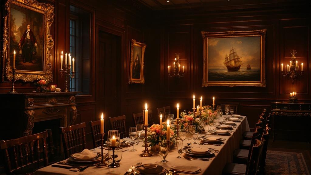
Trinity House as atmosphere, not illustration
"Georgian neoclassical livery hall on Tower Hill — intimate private dining rooms, maritime paintings, candlelit."

Direction B uses the atmospheric quality of the room — candlelight, dark wood, Georgian warmth — as a mood rather than a subject. The venue is felt, not depicted. The dignity of the setting is preserved rather than reduced to a postcard.

Choose the direction that speaks first. Everything else follows from there.
La Maison de Fêtes