Aria Nova · Electric Lady Studios · New York · Friday, 4 September 2026
ULTRAVIOLET
Four colours that belong to 9pm in a legendary room. Deep enough to hold silence. Charged enough to hold electricity.
Direction ASubterranean Electric
Direction BULTRAVIOLET Transmission
ChosenB
Where it started
Deep enough to hold silence. Charged enough to hold electricity.
ClientAria Nova
CityNew York
Event dateFriday, 4 September 2026 · 21:00
Guests75 · After Dark
VenueElectric Lady Studios — Studio A, Greenwich Village, New York
The suite · six piecesDigital Invitation · Menu Cards · Welcome Signage · Favor Tags · Monogram · QR Code
The typeface
Bodoni Moda, set both ways.
The client's choice, and exactly right. High-contrast strokes are the typographic equivalent of the album's dynamic range — the hairlines are violet light, the bold strokes are obsidian. Both worlds are set in it; only the discipline changes.
DisplayARIA NOVA
EventULTRAVIOLET
HeadingElectric Lady Studios · Studio A
SubheadingFriday, 4 September 2026 · Nine o'clock
MonogramAN
BodyAria Nova invites you into ULTRAVIOLET. Nine o'clock, Electric Lady Studios. RSVP required. No plus-ones.
Direction A
Subterranean Electric
A
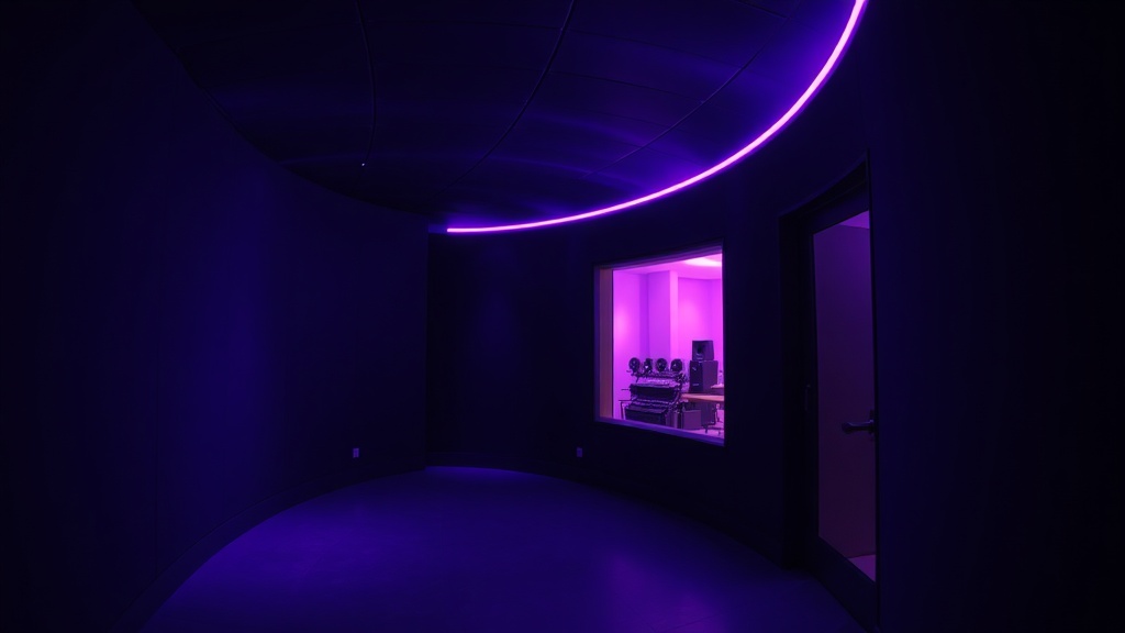
The invitation is a room — the curved underground corridor of Electric Lady, where the album was born. Violet light on curved walls; the geometry of a space that has held Hendrix, Bowie, Beyoncé, and now ULTRAVIOLET. Cinematic and precise: wide-format imagery, Bodoni set with deliberate tension between hairline and bold.
Subterranean Electric — violet light on curved walls, the room as the invitation
Obsidian
#0D0D0D
Primary ground. The dark that makes the violet live.
Electric Violet
#8A2BE2
A light source rather than a colour — type, rules, glow.
Pale Amethyst
#F0E6FF
Primary text. Light held in the dark.
Deep Violet
#2A0D5E
Derived — shadow and depth. The space between the notes.
The voices
Bodoni ModaThe voice that names700 · display
JostThe voice that explains300 · body
✕ Daylight palettes
✕ Soft or romantic type
✕ Any warmth
What this world had still to settle
Whether the corridor can be photographed as it is remembered. Violet light on curved walls is the room; a wide-format picture of a corridor is also just a corridor, and the difference is the lighting on the night of the shoot.
Whether naming the artists who recorded there belongs on the paper. The lineage is the room's real weight and it is also somebody else's name on this artist's invitation.
Whether violet can be a light source in ink. It is defined as light rather than colour, and print has no way to emit — only to sit on the sheet.
Whether Bodoni's hairlines survive on a dark ground. The tension between hairline and bold is the type argument, and the hairline is the first thing to disappear reversed out of obsidian.
Direction B
ULTRAVIOLET Transmission
B
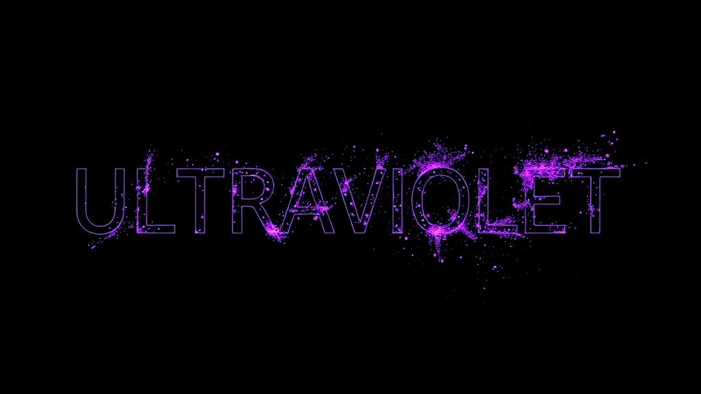
World B never shows the room. It never needs to. Instead: pure typographic force — "ULTRAVIOLET" at a scale that doesn't quite fit, the word broken into its own geometry. A Peter Saville sleeve translated into obsidian and violet, every line placed with Crouwel grid discipline. The title is the only image you need.
ULTRAVIOLET Transmission — the title at a scale that does not quite fit
Deep Violet
#2A0D5E
Primary ground. Depth without weight — the space between the notes.
Electric Violet
#8A2BE2
Signature colour. Reserved, never spread.
Pale Amethyst
#F0E6FF
Primary text. Light held in the dark.
Obsidian
#0D0D0D
Structural dark. Rules, blocks, and the hard edge of the grid.
The voices
Bodoni ModaThe voice that names400 · display
JostThe voice that explains400 · caption
The material, as delivered
Stock Black uncoated
Print1-colour violet foil
FinishUncoated · tactile
Quoted from this suite's own production spec — the stock the invitation was actually printed on. Surfaces are rendered from that spec, not photographed.
✕ Illustrative motifs
✕ Gradient washes
✕ More than one accent
What this world had still to settle
Whether a word that does not quite fit still reads. ULTRAVIOLET broken into its own geometry is the whole image, and legibility is exactly what the device spends.
Whether a Saville sleeve translated is homage or borrowing. The reference is named openly; that honesty does not by itself make the result the artist's own.
Whether grid discipline leaves room for the practical lines. Every line placed to the grid is the rule, and the address, the hour and the RSVP are the lines a grid least wants.
Whether never showing the room is confidence or a gap. The title is the only image you need is a strong claim about a party whose venue is the reason people will come.
The decision, as they saw it
The room, or the signal.
A · Subterranean ElectricB · ULTRAVIOLET Transmission
World A is rooted in place
The room, the curved walls, the underground. Cinematic, place-rooted.
World B is rooted in sound
The word itself, the scale of the title, pure typographic force.
Same palette. Same discipline.
Completely different emotional arrival.
The feeling
The kind of thing people frame.
The briefing described a room holding its breath before the world hears what was made inside it. Seventy-five people who need to hear it before anyone else. That is not a party — it is a moment of trust.
"The handwritten first line of the title track — written in violet ink on a hotel notepad in Oslo, where the creative breakthrough happened."
That detail stayed with us. Both worlds begin there.
Creative declaration
What we committed to — and why.
The palette
Obsidian · Electric Violet · Pale Amethyst
No gradients, exactly as asked. Flat, precise, electric.
The typeface
Bodoni Moda — the client's choice
The hairlines are the quiet passages. The bold strokes are the moments that stay with you.
References honoured
Saville · Crouwel · Emek · Wong Kar-wai
Present in the grid discipline, the typographic courage, and a colour world that belongs to night.
What we avoided
No flyer, no clip-art, no warmth
No music notes, microphones, consoles, gradients or warm tones. Music-industry design, not event design.
The QR code
A design element, not a utility
A transmission point inside the composition in A; a geometric element in the grid in B.
The hidden delight
The Oslo notepad, in violet ink
The handwritten title-track line watermarked into both worlds. Barely visible — the 75 will find it.
The monogram
AN — a label mark, not an ornament
Placed exactly once per piece, the way a mark appears on vinyl. Not decorative. Identifying.
Direction B · Chosen
ULTRAVIOLET Transmission
ULTRAVIOLET Transmission was chosen — the sound, not the room. Six pieces carry the record into Studio A.
Digital InvitationMenu CardsWelcome SignageFavor TagsMonogramQR Code