La Maison de Fêtes · Creative Direction

Prepared for Aria Nova

ULTRAVIOLET
Listening Party

We have prepared two creative directions for your suite.
Choose the one that speaks to you.

Client
Aria Nova
City
New York
Event Date
Friday, 13 February 2026
Venue
Electric Lady Studios — Studio A, New York City
Guests
75 · After Dark
Suite
Digital Invitation · Menu Cards · Welcome Signage · Favor Tags · Monogram · QR Code
02
The Palette

Obsidian · Electric Violet · Pale Amethyst · Deep Violet

Four colours that belong to 9pm in a legendary room. Deep enough to hold silence. Charged enough to hold electricity.

Obsidian
#0D0D0D
Primary ground. Every piece begins here. The dark that makes the violet live.
Electric Violet
#8A2BE2
Signature colour. The album title made visible. Used for typography, rules, and light.
Pale Amethyst
#F0E6FF
Primary text and contrast. Where the eye rests. Light held in the dark.
Deep Violet
#2A0D5E
Derived — shadow and depth. The space between the notes.
03
Typography

Bodoni Moda — the typeface of the suite

You asked for Bodoni Moda. It is exactly right. High contrast strokes — the typographic equivalent of the album's dynamic range. The hairlines are violet light. The bold strokes are obsidian.

Display
ARIA NOVA
Event
ULTRAVIOLET
Heading
Electric Lady Studios · Studio A
Subheading
Friday, 13 February 2026 · Nine o'clock
Monogram
AN
Body
Aria Nova invites you into ULTRAVIOLET. Friday, February 13th, 2026. Nine o'clock. Electric Lady Studios. Greenwich Village, New York. RSVP required. No plus-ones.
Direction A concept — Subterranean Electric
Direction A · Concept Preview · Not Final

Subterranean Electric

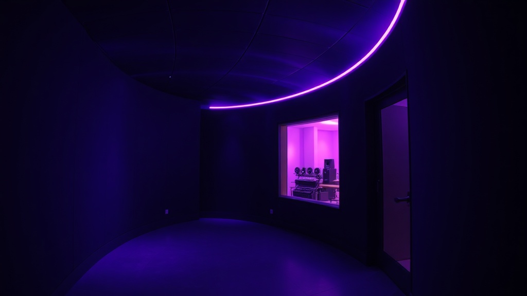
The invitation is a room. Specifically: the curved underground corridor of Electric Lady — the room where the album was born. Direction A is rooted in place, in the physical weight of where this all happened. Violet light on curved walls. The geometry of a space that has held Hendrix, Bowie, Beyoncé — and now ULTRAVIOLET.

The design language is cinematic and precise. Wide-format imagery. Bodoni Moda set with deliberate tension between hairline and bold. The QR code arrives as a design element — a transmission point embedded in the composition, not appended to it. The AN monogram appears once, as a label mark on vinyl: small, confident, exactly where it should be.

Direction A · Subterranean Electric · Invitation Sketch · Not Final
Aria Nova
invites you into
ULTRAVIOLET
Friday, February 13th, 2026
Nine o'clock
Electric Lady Studios
Greenwich Village, New York
RSVP required  ·  No plus-ones
RSVP NOW →
Direction A · Subterranean Electric · Concept only — typography, layout, and proportions will be refined to final quality
Direction B concept — ULTRAVIOLET Transmission
Direction B · Concept Preview · Not Final

ULTRAVIOLET Transmission

Direction B never shows the room. It never needs to. Instead: pure typographic force. "ULTRAVIOLET" at a scale that doesn't fit. Letters that are almost too large. The word broken into its own geometry — a Peter Saville Factory Records sleeve translated into obsidian and violet. The album title is the only image you need.

This is the bolder reading of the briefing's hidden heart. "This is a piece of art, not an invitation." Direction B takes that literally. Every line of copy is positioned with Wim Crouwel grid discipline. The handwritten Oslo notepad line appears once — in violet, at barely visible scale — as a watermark. Only people who look closely find it.

Direction B · ULTRAVIOLET Transmission · Invitation Sketch · Not Final
ULTRAVIO
LET
Aria Nova  ·  13 February 2026  ·  21:00
Electric Lady Studios · Studio A · New York
RSVP Required · No Plus-Ones
AN
AN
Direction B · ULTRAVIOLET Transmission · Concept only — spacing, scale, and composition will be refined to final quality
06
The Feeling

"The kind of thing people frame."

When I read your briefing, I heard something specific: the feeling of a room holding its breath before the world hears what was made inside it. Seventy-five people who need to hear it before anyone else. That is not a party — it is a moment of trust.

"The handwritten first line of the title track — written in violet ink on a hotel notepad in Oslo, where the creative breakthrough happened."

That detail stayed with me. Both directions begin there — they simply arrive differently. Direction A takes you into the room itself: the curved walls, the violet light, the physical weight of Electric Lady. Direction B takes you into the music: the word ULTRAVIOLET at a scale that feels sonic, not decorative. Both will be the kind of thing people frame.

07
Creative Declaration

What we committed to — and why

The palette
Obsidian, Electric Violet, Pale Amethyst. No gradients — exactly as you asked. Flat, precise, electric. The colours of the album title made visible in physical space.
The typeface
Bodoni Moda. Your choice, confirmed. High-contrast strokes that mirror the album's dynamic range. The hairlines are the quiet passages. The bold strokes are the moments that stay with you.
The references honoured
Peter Saville, Wim Crouwel, Emek, Wong Kar-wai. All four are present — in the grid discipline, the typographic courage, the poster-scale composition, the colour world that belongs to night.
What we avoided
No music note graphics. No microphone iconography. No recording console photographs. No gradients. No warm tones. Nothing that looks like a venue's event flyer. This is music-industry design — not event-planning design.
The QR code
In both directions, the QR code is a design element, not a utility. Direction A: embedded as a transmission point within the composition. Direction B: positioned as a geometric element within the grid. It links to the 90-second preview from September 3rd, 23:59.
The hidden delight
The Oslo notepad handwriting — the first line of the title track, in violet ink — appears as a watermark in both directions. Barely visible. The 75 people who will be in that room are the kind of people who will find it.
The monogram
AN — designed to function as a label mark. The kind that appears on vinyl. Small, confident, placed exactly once per piece. Not decorative. Identifying.
What differs between A and B
Direction A is rooted in place — the room, the curved walls, the underground. Direction B is rooted in sound — the word itself, the scale of the title, pure typographic force. Same palette. Same discipline. Completely different emotional arrival.
08
Your Choice

Which direction feels right?

Both directions are built from your briefing — they interpret it differently. The room, or the sound. Choose the one that resonates, and your full suite will be built from that vision alone.

Direction A — Subterranean Electric
Direction A
Subterranean Electric
Cinematic · Place-rooted
Direction B — ULTRAVIOLET Transmission
Direction B
ULTRAVIOLET Transmission
Typographic · Sound-led
La Maison de Fêtes