La Maison de Fêtes · Creative Direction

Prepared for Jed Ortiz

TIDEWATER

We have prepared two creative directions for your suite.
Choose the one that feels like the film.

Client
Jed Ortiz
City
Austin, Texas
Event Date
Saturday, 7 November 2026
Venue
The Ritz · Alamo Drafthouse · Austin, Texas
Guests
55 · Film community, cast & crew
Suite
Digital Invitation · Printed Ticket-Invitation (×55 named) · Event Programme · Welcome Signage
02
The Palette

The Curtain · Celluloid Grain · Aged Stock

Three colours drawn from the words in your briefing. Not chosen — discovered. They were already there, waiting in the sentences about the Ritz curtain, the silver of the film stock, and the surface of a wall in a coastal diner.

The Curtain
#5C0A0A
The crimson of the velvet at the Ritz before the lights go down. Used for the film title, key rules, and one structural accent per piece.
Celluloid Grain
#B8B8B8
The silver of 16mm film stock. Present as texture and secondary type — the grain visible in the paper itself, never applied as decoration.
Aged Stock
#FFF8F2
The ground of all printed pieces. Warm cream, not white — closer to the feel of paper that has been somewhere, held something, survived a few decades.
03
Typography

DM Serif Display — the typeface of the suite

Your chosen typeface. It carries the authority of a cinema marquee in its upright form and the intimacy of a handwritten programme note in its italic. Both directions use it. They use it differently.

Display
TIDEWATER
Event
A Private Screening
Heading
The Ritz · Alamo Drafthouse · Austin, Texas
Subheading
Saturday, November 7th, 2026 · Eight o'clock
Monogram
JO
Full copy
Jed Ortiz invites you to the first and only private screening of Tidewater. Saturday, November 7th, 2026. Eight o'clock. The Ritz, Austin, Texas. 35mm print. Followed by a conversation with the director.
Direction A — The Criterion Restraint
Direction A · Concept Preview · Not Final

The Criterion Restraint

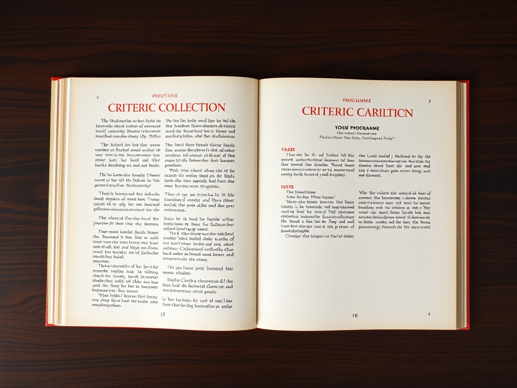
Drawn from the printed programmes that accompanied early Criterion Collection releases — documents that treated cinema as literature. DM Serif Display upright, centered, at commanding scale. The title TIDEWATER breathes at the top of the page. Cream field, ink letterforms, the crimson used exactly once: on the film title. The silver grain is in the paper itself — never applied as decoration.

Every piece in the suite reads like an archive object — the kind you'd find preserved in a cinematheque library fifty years from now. The printed ticket-invitation is spare and precise. The programme is multi-page and academic. The signage at the Ritz is a single large letterform on cream. Nothing announces itself. Everything is exactly what it is.

Direction A · The Criterion Restraint · Invitation Sketch · Not Final
Jed Ortiz
invites you to the first and only private screening of
TIDEWATER
Saturday, November 7th, 2026
Eight o'clock
The Ritz · Austin, Texas
35mm print · Followed by a conversation with the director
Direction A · Criterion Restraint · Concept only — typography, layout, and proportions will be refined to final quality
Direction B — The Diner Ephemera
Direction B · Concept Preview · Not Final

The Diner Ephemera

Rooted in the printed matter of 1950s–70s coastal Texas — diner menus, salt-worn event programmes, the kind of thing printed in small runs for a community that showed up anyway. All three palette colours present and equal. The paper grain is a protagonist. DM Serif Display in italic, with varied weight hierarchy suggesting a handset type job from a small-town press.

The invitation feels found rather than designed — like something you'd discover in the Port Lavaca motel where you wrote the screenplay. Each named ticket reads like a personal dispatch. The back — aspect ratio, format, runtime, the final line — is laid out like a film can label. The physical world of the film bleeds into the object you hold in your hand.

Direction B · The Diner Ephemera · Invitation Sketch · Not Final
Jed Ortiz · Private Screening
Tidewater
Saturday, November 7th, 2026
Eight o'clock
The Ritz · Austin, Texas
35mm print
JO
"There's nothing left to protect out here." — Final line · Tidewater
Direction B · Diner Ephemera · Concept only — texture, layout, and proportions will be refined to final quality
04
The Feeling

"I need the invitation to carry the same weight as the film."

When I read your briefing, I heard something specific: not importance — weight. The weight of a film that was shot in eighteen days on an island with no phone signal, by people who gave themselves to it entirely. Fifty-five guests who need to understand, before they arrive, that this is not a party. It is a moment of trust.

"A strip of 16mm leader from the first roll of film shot on Matagorda Island — taped into a notebook on the first day of production. Black frames, no image. The beginning before anything existed."

That detail stayed with me. Both directions begin there. Direction A takes you into the archive — the world that preserved films like this, the culture that took cinema seriously as literature. Direction B takes you into the physical world of the film itself — coastal, worn, immediate, the Port Lavaca motel made tangible. Both will carry the weight you asked for. They simply carry it differently.

05
Creative Declaration

What we committed to — and why

The palette
Deep crimson, celluloid silver, aged cream. Three colours, not more. The crimson is the Ritz curtain. The silver is the grain in the film stock. The cream is the paper. They were already in your sentences.
The typeface
DM Serif Display. Your choice, confirmed. Upright in Direction A — it commands the page like a marquee. Italic in Direction B — it gives the warmth of a handwritten note. Both are exactly right for what each direction needs.
The prohibitions honoured
No film reel. No clapperboard. No award-season prestige typography. No festival poster grammar — nothing that reads as SXSW or Sundance. No photography from the film. The film reveals itself in the theater.
The references
Criterion Collection printed programmes (1970s–80s), Wim Wenders title card typography from Paris, Texas and Kings of the Road, the Sight & Sound poster archive, Robert Frank's The Americans. All present — in the restraint, the layout discipline, the refusal of decoration.
The ticket-invitation
55 versions. Each one named — variable print. Front: the invitation. Back: aspect ratio 1.33:1, format 16mm / 35mm print, running time 94 minutes, and the last spoken line of the film. In Direction A, set in small-caps as a technical credit. In Direction B, set in italic as a final word.
The screenplay line
"There's nothing left to protect out here." It appears on the back of every ticket — in both directions. It is not a caption. It is a key design element. The last thing each person reads before they take their seat.
What differs
Direction A is rooted in archive — the culture that preserved this kind of film. Direction B is rooted in place — the physical world where the film was born. Same palette. Same typeface. Same prohibitions. Completely different emotional arrival.
What comes next
Choose your direction and the full suite is built from that vision alone: digital invitation, printed ticket-invitation (×55 named), event programme, and welcome signage for the Ritz lobby. Nothing is finalised until you choose.
06
Your Choice

Which direction feels right?

Both directions are built from your briefing. They read it differently — one follows the archive, one follows the place. Either will be executed with equal commitment. Choose the one that feels like Tidewater.

Direction A
Direction A
The Criterion Restraint
Archive Gravity · Intellectual
Direction B
Direction B
The Diner Ephemera
Coastal Warmth · Intimate
La Maison de Fêtes
La Maison de Fêtes