Miriam & Daniel Kessler · 28 June 2026 · Griffen Avenue, Scarsdale, New York
Baby Kessler
בְּרִית מִילָה וּקְרִיאַת שֵׁם
The brief was the weight of a name — one that survived Lodz, crossed an ocean, and arrives on a stone terrace in Scarsdale. Two worlds carry it: one engraves the word, one lets the morning light hold it.
Direction AThe Engraved Letter
Direction BChagall’s Morning
ChosenB
Where it started
The briefing did not describe a party. It described a boy born on the summer solstice, after three years of waiting, carrying a name that survived Lodz, crossed an ocean, and arrived at a stone terrace in Scarsdale to be spoken aloud for the first time.
Both worlds below were built in full from that brief. Read both before choosing. Take your time.
This is not a party. It is a covenant.The line every decision was held against
“The design should feel like it has always existed — calm, ancient, precise — as if it were waiting for this family too.”
Miriam Kessler, from the briefing · held as the standard for every design decision
tallit blue · linen · parchment · morning light · ancient · considered · quiet ceremony · scholarship · Scarsdale · a name that survived
The type · one bilingual pairing, both worlds
Baby Kessler
י״ג תמוז תשפ״ו
Miriam & Daniel Kessler welcome you to the brit milah of their son.
Display & headlines
Cormorant Garamond Light Italic
300 weight · Names · Event title · English display
Hebrew & bilingual detail
סְעוּדַת מִצְוָה
Frank Ruhl Libre 300 · Hebrew name · Date in Hebrew letters · Order of service
The rule that governs both
Equal weight, neither subordinate
English and Hebrew set at the same size and colour on every piece — the bilingual setting is the design, not a translation added afterwards
Direction A
The Engraved Letter
Typographic modernism as sacred ceremony — the word itself, set with precision, is the ritual gesture.
A
This direction treats typography itself as the ceremony — the considered arrangement of letter forms as ritual gesture, the negative space as sacred pause. It draws on El Lissitzky’s early constructivist book design and the spare dignity of Schocken Verlag, the press that brought Kafka, Agnon and Benjamin to the world before 1938. English and Hebrew stand side by side at equal weight, neither subordinate.
A thin arch rule — echoing both the Tudor arched entryways of the Griffen Avenue house and the arc of a Torah scroll — frames the content, with fine hairline geometry in the tradition of the Bezalel Academy’s 1950s print work. A discreet engraved-line kiddush cup appears on the ceremony programme, so small and precise it reads first as ornament, then as symbol. The design does not announce its Jewishness. It simply is Jewish, in the way that a well-made book is Jewish without saying so.
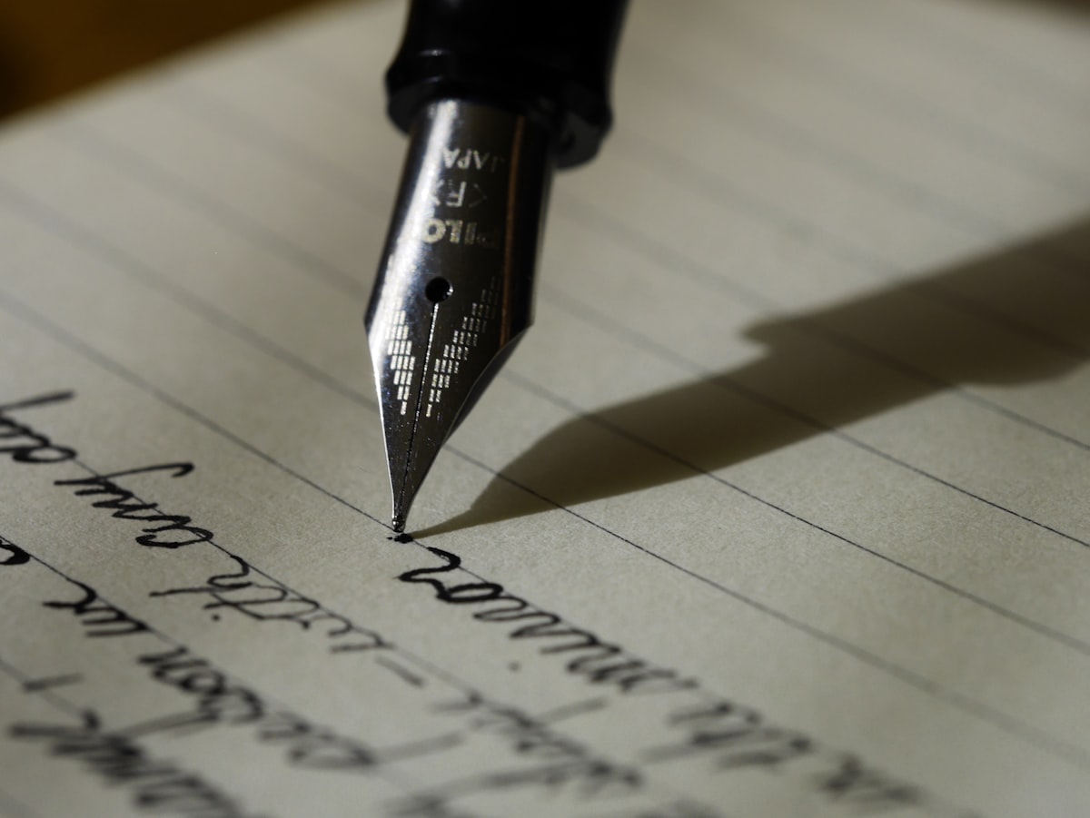
The Engraved Lettera nib on ruled paper — the mark itself, not ornament, is the ritualMorning Blue · the four colours, led by the paper
Linen
#F2EDE4
Ground · Paper
Morning Blue
#A9BAC4
Primary · Accent
Ink Slate
#3D5A6A
Secondary · Structure
Parchment
#C8B89A
Warmth · Details
The type · two voices, equal weight
Cormorant Garamond300 Italic · display
Frank Ruhl Libre300 · Hebrew
The voice that names, and the voice that explains.
How it would read, piece by piece
Visual register
El Lissitzky constructivism × Schocken Books — spare, considered, bilingual
The invitation
Typography as ritual — English and Hebrew at equal weight, neither subordinate
The welcome sign
Arch-ruled border, monogram MDK in Cormorant, standing in the entry hall
The ceremony programme
A discreet engraved-line kiddush cup — ornament first, symbol second
The suite
Digital Invitation · Menu Cards · Ceremony Programme · Welcome Signage · Favour Tags · Table Numbers · Thank You Card · Birkat Hamazon · Sandak Chair Sign
“A guest holds this and does not think ‘Jewish design.’ They think: serious. Considered. The design does not announce its Jewishness. It simply is Jewish, in the way that a well-made book is Jewish without saying so.”
What we will never do — the briefing was precise
✕ Baby shower language
✕ Balloons
✕ Generic celebration aesthetic
✕ Decorative Jewish symbols used as ornament
What this world had still to settle
Whether the kiddush cup can be small enough to be missed. Reading first as ornament and then as symbol is the intention; drawn that fine, on one piece only, it may never make the second reading at all.
Whether English and Hebrew truly stand at equal weight. Two scripts with different x-heights and opposite reading directions are equal only if somebody decides what equal means, and that decision has not been made.
Whether the arch is the house or the scroll. It is offered as both. They are different curves, and drawing one that serves both may end up serving neither.
Whether a design can be Jewish without saying so and still be recognised. That is the world's whole claim, and it is the one thing nobody has tested on a guest.
Direction B
Chagall’s Morning
Luminous atmosphere as sacred ceremony — the morning light that arrives on the longest day.
B
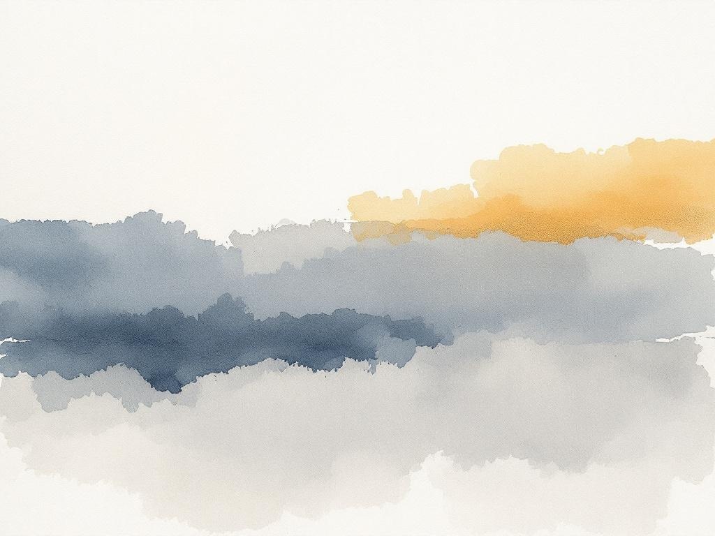
This direction takes the briefing’s most precise instruction — “the morning light in Chagall’s blue-and-white works, not the figures, but the quality of luminous calm” — and makes it the entire visual language. A softly painted watercolour wash provides the atmosphere: not illustrative, not symbolic, just the quality of light that arrives on a summer morning through old Tudor windows.
Cormorant Garamond floats within that wash with quiet authority — the type is the anchor, the image is the weather. A single olive branch in fine ink appears at the corner of the ceremony programme: ancient, unadorned, immediately legible as the branch of peace that outlasted everything. The Hebrew name Binyamin Dov is set in Frank Ruhl Libre, pressing gently into the luminous field like an inscription on a silver cup — or on a life.
Chagall’s Morningthe watercolour wash the type sits in — light, never figureMorning Blue · the same four colours, led by the light
Morning Blue
#A9BAC4
Primary · Accent
Linen
#F2EDE4
Ground · Paper
Ink Slate
#3D5A6A
Secondary · Structure
Parchment
#C8B89A
Warmth · Details
The type · two voices, equal weight
Cormorant Garamond300 Italic · display
Frank Ruhl Libre300 · Hebrew
The voice that names, and the voice that explains.
How it would read, piece by piece
Visual register
Chagall luminous blue × watercolour wash · morning light through old Tudor windows
The invitation
A soft painted field — you feel the morning before you’ve read a word
The welcome sign
Large-format wash, “Kessler” in Cormorant, standing in the morning light of the entry hall
The ceremony programme
A single olive branch in fine ink at the corner — the branch of peace that outlasted everything
The suite
Digital Invitation · Menu Cards · Ceremony Programme · Welcome Signage · Favour Tags · Table Numbers · Thank You Card · Birkat Hamazon · Sandak Chair Sign
“A guest opens this and feels the morning light. Not baby imagery, not generic celebration. The quality of a summer morning in an old house, when something new has arrived that changes everything.”
What we will never do — the briefing was precise
✕ Baby shower language
✕ Balloons
✕ Generic celebration aesthetic
✕ Decorative Jewish symbols used as ornament
What this world had still to settle
Whether a wash can be atmosphere and not illustration. Not illustrative, not symbolic, just the quality of light — a line held by whoever paints it, on every piece.
Whether type floats or fights inside the wash. The type is the anchor and the image is the weather; on the pieces with the most to say, the weather has to give way and no rule says how.
Whether one olive branch is enough. Ancient, unadorned, on the programme alone — it is either perfectly rationed or the only figurative mark in a suite that could carry more.
Whether a Hebrew name can press into a wash and stay sharp. Set like an inscription on silver is the image; ink into a damp field is the opposite of an inscription, and the two have not been reconciled on paper.
The decision, as they saw it
The word, or the light.
A · The Engraved LetterB · Chagall’s Morning
Direction B · Chosen
Chagall’s Morning
Chagall’s Morning was approved. Nine pieces carry the morning light of the longest day.
A suite built from the gravity of what this day carries — the accumulated meaning of a name that survived Lodz, crossed an ocean, and arrived at a stone terrace in Scarsdale to be spoken aloud for the first time.
The feeling
Ancient and new at once — the specific calm of a family gathered around something they have waited for.
The two directions
Direction A grounds the suite in the precision of the word itself. Direction B grounds it in the quality of light. Both believe Baby Kessler’s arrival deserves design serious enough to match the weight of this day.
What we will never do
No baby shower language. No balloons. No generic celebration aesthetic. No decorative Jewish symbols used as ornament. This family’s briefing was precise and this suite must be too.
PiecesNine
Hebrew dateי״ג תמוז תשפ״ו
VenueGriffen Avenue, Scarsdale, New York
Date28 June 2026
The choice
What the choice turned on
The same four colours, the same bilingual type, the same morning. What changed was whether the ceremony was carried by the letterforms or by the light.
A — The Engraved Letter
Typography itself as the ritual gesture — El Lissitzky and the Schocken Verlag, English and Hebrew at equal weight, a thin arch rule echoing both the Tudor entryway and the arc of a scroll. The design does not announce its Jewishness; it simply is Jewish, the way a well-made book is.
B — Chagall’s Morningbuilt
The briefing’s most precise instruction made into the whole visual language — “the morning light in Chagall’s blue-and-white works, not the figures, but the quality of luminous calm.” The type is the anchor and the image is the weather.
A · The Engraved Letter
B · Chagall’s Morning
What carries the ceremony
The letterforms, arranged.
The light, painted.
The image
None — geometry and a thin arch rule.
A soft watercolour wash; you feel the morning before you read a word.
The one symbol
An engraved-line kiddush cup — ornament first, symbol second.
A single olive branch in fine ink at the programme’s corner.
Which colour leads
Linen — the paper leads, morning blue accents.
Morning blue — the light leads, linen becomes the paper it falls on.
The Hebrew
Set beside the English at equal weight, neither subordinate.
Pressed gently into the luminous field, like an inscription on silver.
What a guest thinks holding it
“Serious. Considered.”
“This is what that morning felt like.”
The Kesslers chose B — the suite was built from it.