Direction A
The world of the day
The Fruit Stand
The invitation is a produce-crate label, not a drink ad — the same confident fruit-as-graphic tradition Maya already keeps in a drawer, printed bold because flat ink was never allowed to blend.
flat colour, hard edge
fruit is the hero, never a photo
cream ground, full daylight
one foil arc, as the fizz
Two winters ago, in a Greenpoint apartment eleven blocks from this glasshouse, a formulation chemist tired of drinks that looked like pharmacies started hand-labelling bottles for friends. NURA launches on the exact date that first batch was brewed. This world hands guests the fruit the way Maya's own vintage California crate labels do it — oversized, flat-inked, joyful — so the graphic carries the story before a single word is read.
— The Fruit Stand, p.1
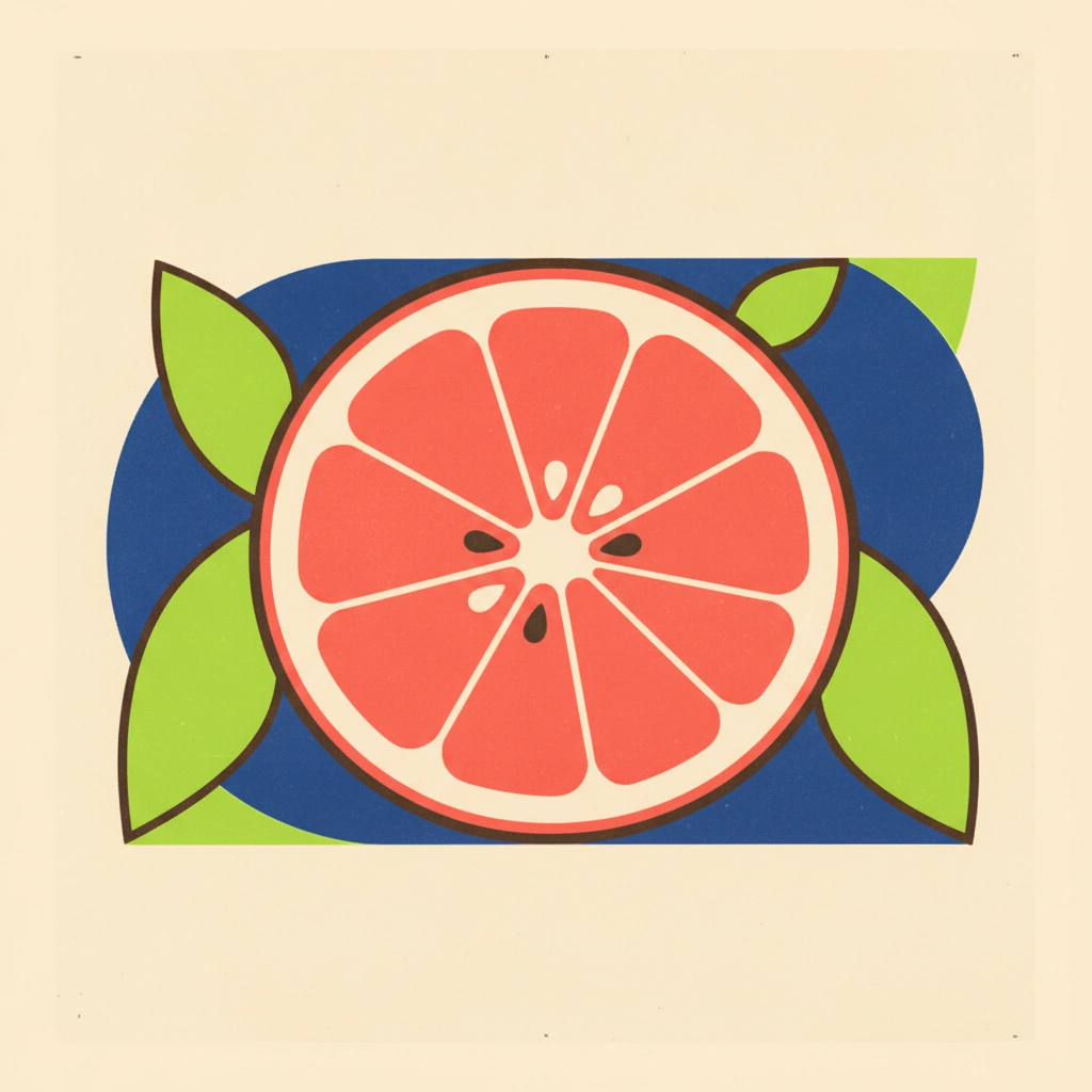
the crate label — one oversized citrus cross-section, flat ink, hard outline, the fruit doing all the talking
palette in context — the five brights as real matte paper, colour-blocked, never blended
Coral crush
#FF5C4D
Lead
Cobalt hour
#2440E0
Palette only
the room by day — the glass rope factory flooded with light, a fruit form at sculpture scale
Type specimen
N
NURA
display — Archivo 800, expanded
17 September 2026 · Brooklyn
text — DM Sans, 500 caps, tracked
one bold announcement mark — packaging voice, nothing competing with the name
the mark — a flat lime wedge as a silhouette badge, the suite's repeatable stamp
rigid cream board, rounded corners — the can silhouette in the hand
the one foil — an iridescent arc across the rind, shown at print scale
Lime
#B5E848
In the imagery
fruit as hero
the fizz, once
The crate label — Maya collects vintage California citrus-crate labels; the board draws the fruit as flat graphic in that exact print tradition, never the stock fruit photography the brief bans.
Palette in context — coral, cobalt, lime, lavender and cream shown as real cut paper, colour-blocked not gradient-blended, straight out of the brief's Sottsass / Memphis reference.
The one foil — iridescent foil is rationed to a single condensation-arc across the rind — "the fizz, not the wallpaper," in the brief's own words.
How this world lands
InvitationRigid cream board, rounded corners; one oversized crate-label fruit, foil arc across the rind.
SuiteEach station's card carries one flavour's flat colour-block; the fruit crops off the edge like a cut sheet.
Signage & spaceEntry fruit at sculpture scale, one flavour per zone, matched to the venue's oversized fruit forms.
DigitalRSVP page as a cream crate label; the NU mark nested in the fruit, doubling as sticker and can-top seal.
Guest arcArrive to the grove in full colour → taste four flavours at four colour-blocked stations → leave with a first-batch four-pack.