VM
Event Identity · 2026
Event Identity Document
Direction B
The Mediterranean
Still Life
Event Identity · Valentina Moreau
Event Identity Document
Direction B
Event Identity · Valentina Moreau
§ 01 — The Event
§ 02 — Creative Direction
Direction B · Oranges & Blue
The invitation as a still life — something Valentina would keep on her shelf long after July.
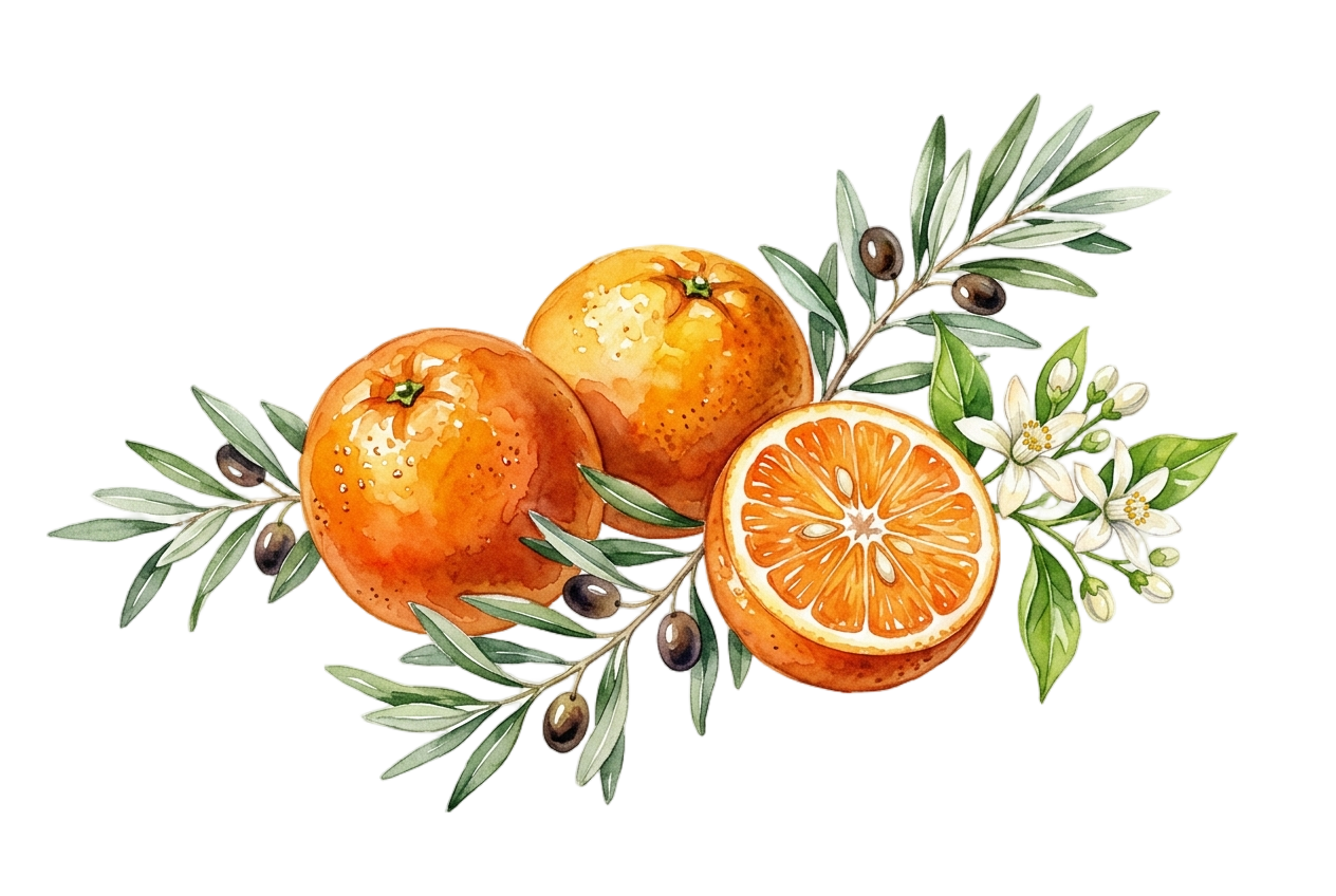
Warm linen ground, hand-painted citrus — oranges, lemons, olive branch — over cobalt gingham. The colour is joyful and alive, but arrives through texture and illustration rather than graphic force. Intimate. Handmade in spirit. The kind of invitation guests tuck into a drawer and find again years later.
Watercolour citrus, olive branch, white blossom — the central illustration of Direction B
Mood
Direction A vs Direction B
| A — The Cobalt Terrace | B — The Still Life (chosen) | |
|---|---|---|
| Ground | Deep cobalt blue — the card is the architecture | Warm linen — the card is the table |
| Typography | White reversed-out on cobalt — bold, graphic | Charcoal on linen — intimate, legible |
| Illustration | Citrus as accent against the blue ground | Hand-drawn citrus, botanical, gingham texture |
| Guest reaction | Held at arm's length to admire | Held close, kept long after the night |
| Mood word | Architectural warmth | Mediterranean domestic |
| Paper finish | Matte laminate — vivid, saturated cobalt | Uncoated natural — textured, warm |
Choose B if —
Valentina values the crafted over the loud — the illustration on linen arrives as a gift in itself. Warm, collected, something guests keep.
§ 03 — Colour Palette
Linen
#F2EBE0
Primary ground · All stationery surfaces · The afternoon light
Burnt Orange
#E84822
Signature colour · Dividers · Milestone text · The orange
Grove Green
#3A6B35
Labels · Eyebrows · Table numbers · The olive branch
Cobalt
#2B52C8
Gingham pattern · RSVP block · Structural accent only
Charcoal
#2A2218
Primary text · Guest names · Display headings
Burnt Orange is the signature accent. It appears on milestone typography, divider lines, and decorative dots. Never as a background fill.
Grove Green is reserved for labels and eyebrow text. It reads as a quiet organisational signal — never for display headings or body copy.
Cobalt exists only as the gingham pattern and the RSVP block tint. It must never appear as a text colour or solid field outside these uses.
Linen is the ground. All stationery surfaces are Linen. The canvas background (Warm Taupe #D0C8BC) is only for staging — never appears in print.
§ 04 — Typography
§ 05 — The Illustration
Watercolour on white — oranges, olive branch, white blossom, cut citrus
Usage Across the Suite
Invitation
340 × 200px · centred above title · full opacity · botanicals facing down
Menu Card
200 × 120px · centred header · full opacity · smaller scale
Place Card
90 × 90px · top-right corner · 65% opacity · cropped to corner
Illustration Rules
Never crop below the midpoint of the central orange — the half-cut citrus face must remain visible at all sizes
Always used on linen ground — never placed on cobalt, orange, or any solid colour field
The gingham pattern and the botanical must never overlap — one provides structure, the other warmth
Do not add drop shadows, borders, or vignettes to the illustration — the white cut-out edges are intentional
§ 06 — The Gingham Mark
Construction Rule
§ 07 — The Suite
The primary communication piece. Botanical centred above the text; cobalt gingham ribbon frames the card top and bottom. Oslo-style watermark optional for personalisation. Guest name line left open for personalisation.
Five-course evening menu with wine note. Smaller botanical at the top; Cormorant for course names, italic for descriptions. Cobalt tint box for the sommelier note. Gingham top and bottom.
A6 landscape tent-fold. Front face: table number in Grove Green, guest name in Cormorant italic at 38pt, botanical corner accent. Back face: event reference printed upside-down. Gingham left-edge stripe on the front.
Quinta da Luz · 16 May 2026
Valentina · 40
Table 3
Sophie Arnaud
16 May 2026 · Quinta da Luz
Quinta da Luz · 16 May 2026
Valentina · 40
Table 1
Marc Fontaine
16 May 2026 · Quinta da Luz
Quinta da Luz · 16 May 2026
Valentina · 40
Table 2
Élise Moreau
16 May 2026 · Quinta da Luz
Quinta da Luz · 16 May 2026
Valentina · 40
Table 5
Thomas Vidal
16 May 2026 · Quinta da Luz
A6 landscape reply card, enclosed with the invitation. Guest circles attendance; dietary notes left open for handwriting. Botanical corner, cobalt tint reply box. Returns by 30 June.
A5 portrait tent card. Number set in Cormorant Garamond at display scale — legible across the table. Gingham top ribbon, botanical lower-right corner, event reference in Grove Green at foot. Shown as a set of three.
A5 portrait standing card on the bar and cocktail tables. Welcome aperitivo, a signature cocktail named for the evening, curated wines and soft options. Same botanical header as the dinner menu — smaller, lighter.
Large landscape display board at the estate entrance. Botanical centred; event name in full display scale. Doubles as a seating announcement — guests collect their place card from the welcome table on arrival.
A6 landscape note card, dispatched within a week of the dinner. Botanical upper-right, thank-you verse from Valentina in Cormorant italic. Blank lower panel for a handwritten line. Gingham top strip only — lighter than the invitation.
DL insert for the mailing envelope. Cobalt gingham covers the full liner face — the pattern that lives as a ribbon on every other piece here becomes the whole interior. Botanical ghost bottom-right, monogram VM centred. The surprise when the envelope is opened.
§ 08 — Production Notes
Invitation Card
Menu Cards
Place Cards
Colour Conversion
The Mediterranean Still Life · Event Identity · 2026
Valentina Moreau · 40th Birthday Dinner
Quinta da Luz · Private Estate · 16 May 2026
Design by La Maison de Fêtes