Choose your world
Same universe, different story. Read both — then tell us which one is you.
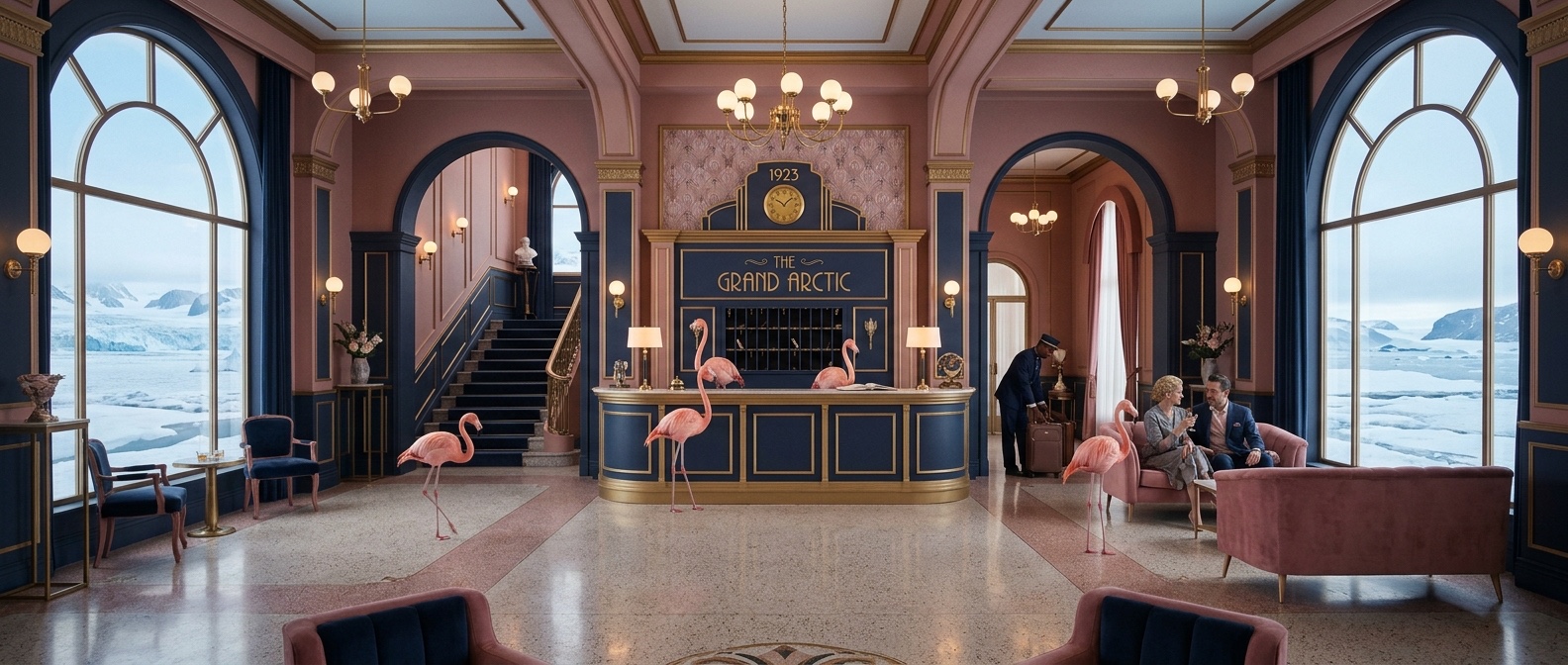
L'Hôtel du Bout du Monde
"Welcome to the Grand Hôtel. We have been expecting you. The flamingos handle luggage. The concierge is Peter. Melissa runs the front desk. Dinner is served."
The venue becomes an absurdist grand hotel stranded in the middle of an arctic landscape — white floors, pink tiled front desk, navy livery, impeccable service for a party that should not logically exist here. Guests check in. Staff (real!) wear navy-and-rose hotel uniforms. The couple are the proprietors of this impossible place.
- Custom monogram — flamingo motif woven into an ornate hotel crest
- Invitation suite: hotel envelope with a room key insert card
- Save the date in the format of a hotel reservation notice
- RSVP card styled as a check-in confirmation slip
- Menu cards: hotel dining room layout, courses named after suites
- Table numbers as brass room number plaques
- Welcome signage in grand hotel lettering on ivory stock
- Bar menu in navy + rose with hotel livery detailing
- Seating plan formatted as a guest register
- Thank you card with hotel concierge illustration
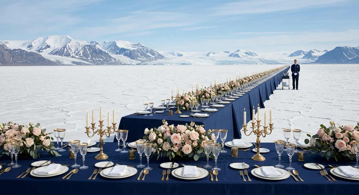
La Grande Traversée
"Two people. One ship. Pink sails. Uncharted ice. This party is the send-off before the great voyage — and you are all crew."
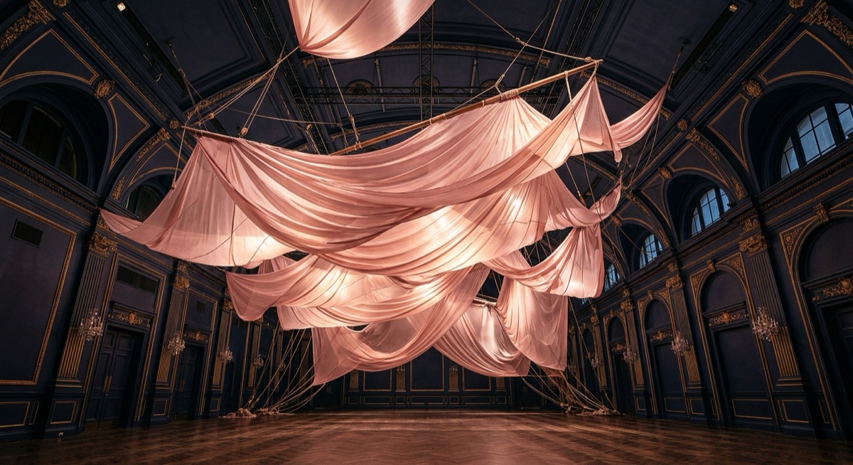
The engagement as departure point: two people setting out on a grand, improbable journey together, and the party is their bon voyage. The venue is a ship's ballroom — navy hull, brass lanterns, pink sails rigged overhead as a canopy installation. Guests are the crew and passengers of this impossible arctic vessel.
- Custom monogram — initials set within a compass rose + anchor motif
- Invitation suite: voyage ticket format in navy + rose foil
- Save the date as a departure notice with imaginary coordinates
- RSVP card styled as a passenger manifest entry
- Menu named after ports and latitudes that don't exist
- Table numbers as nautical coordinates on navy card
- Welcome signage as a ship's notice board in brass and ivory
- Bar menu with rope border detailing in navy + rose
- Seating plan as the ship's passenger register
- Thank you card with a pink-sailed ship illustration