Event Identity Document · Confidential
§ 01 — The Event
§ 02 — Creative Direction
Direction B · Selected
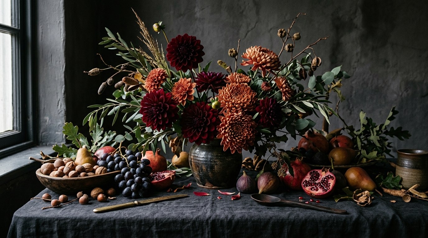
This is October as Kinfolk sees it — not a soft season but a dramatic one. The identity draws from the harvest calendar rather than the florist's window: the weight of burgundy, the brightness of mustard, the depth of olive. Architecture over ornament. Typography that earns its weight. A wedding suite that looks like an editorial spread you haven't seen yet.
Mood
What This Identity Is Not
§ 03 — Colour Palette
Burgundy
#7A1F2C
Primary ground · Save the Date · Dominant authority
Terracotta
#C4786A
Invitation card · Arch ground · Warmth
Olive
#576930
RSVP ground · Depth · The garden wall
Mustard
#C99228
Signal accent · Circle motif · Envelope geometry
Cream
#EAE0D0
Menu card · Primary text on dark grounds
Blush
#D4B3A5
Place cards · Quiet note · Late light
Burgundy is the keynote. It appears on the primary Save the Date and in the envelope liner's geometry — never on the cream pieces. Text on burgundy must be cream at ≥ 80% opacity.
Mustard is the signal colour — the one moment of warmth that animates an otherwise restrained palette. Used as accent only: the circle on the RSVP, geometric blocks in the liner. Never as a ground.
Terracotta carries the invitation — a warmer, more personal tone than burgundy. It is the colour of the first greeting. It does not appear alongside burgundy on the same face.
Cream is the menu's world. On light grounds, all body text must be dark charcoal at ≥ 85% opacity. The cream card is never pure white — the warmth is the point.
§ 04 — Typography
§ 05 — A · A Monogram
Primary · Charcoal
Outlined · Burgundy
Burgundy Field
Small · Tracked
Inverted · Cream
Mustard Field
§ 06 — The Suite
Burgundy ground. Playfair Display 900-weight cream letterforms. The autumn announcement — bold, unambiguous, the colour of the season.
Terracotta arch ground with cream typography. The formal greeting — a warmer, more personal tone than the save the date. The colour of the first meeting.
Olive ground, mustard circle accent. Fully rounded corners. The garden wall acknowledges its guests — die-cut at 12mm radius on all four corners.
Cream stock, dark ink. Wavy die-cut border on all edges. Four courses set in Cormorant Garamond — the table's quiet companion.
Blush ground, guest name set in large Playfair italic. Table designation in small-caps below. One per setting — the suite's most intimate piece.
Ivory stock, terracotta letterpress. The A & A monogram anchors a 5 × 5 inch printed napkin — folded to a diamond for each cocktail hour setting. The suite's most tactile piece.
§ 07 — Production Notes
Save the Date & Invitation
RSVP Card
Menu Card
Place Cards
Cocktail Napkin
Récolte Éditoriale · Event Identity · 2026
Alice Harper & Antoine Bernard
Château de Vaux-le-Vicomte · Maincy, France
Samedi, 21 Mars 2026
Design by La Maison de Fêtes
Confidential · For the eyes of Alice Harper only